TANYAPANČIĆ

Design · Development · Automation

Website design and development.The custom kind.

I design every site around the business it is for, and I write the code myself - with animations and details that feel considered, and the features you actually need. An online shop. Bookings. A client portal. Publishing straight from a phone.

Reply within 24 hoursFrom 490 EURSites in BG / EN / DE

Custom-made

What you get when a site is made for you.

Работно бюро привечер - лаптоп и топла лампа до прозореца
01

Design people remember

Typography, colour, motion and effects built around your brand. And instead of static mockups - a living prototype in your browser, which you review from your phone before development even starts.

02

Features that fit

Bookings, quotes, client portals, publishing tools. Written around how your team works - which is why they keep getting used.

03

Fast because it is light

Little code, few requests, nothing spare. Speed is built into the structure itself - and Google notices.

04

You own all of it

Hosting, code, data, accounts - everything in your name. Your site runs without depending on subscriptions or licences.

Selected work
Every project - designed and built from scratch.

Лого на Галерия Аспект01Aspect GalleryAn entire gallery, run from a phone. The team never opens WordPress.CultureLogo + design + portal2026

The brief

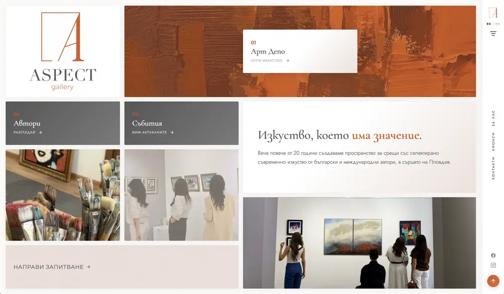
Aspect Gallery has shown contemporary Bulgarian and international art in the centre of Plovdiv for more than twenty years. The whole brief fitted in one sentence: keep it easy, and make it work from a phone.

That sounds simple. It is not. The team photographs a painting while hanging it and posts the event from the opening itself. Hand them anything that ends with logging into an admin panel, and a month later nobody opens it.

Before any of that, there was another job to do. The project arrived with no access to the old code or hosting. Twenty years of exhibitions, biographies and artworks lived only as public pages on a site that could vanish any day.

What I built

  1. A publishing portal Built for the phone, writing to WordPress over the REST API. The team adds artworks, artists, events and news in minutes - without ever having seen wp-admin.
  2. One-button translation Biographies and short descriptions translate into the second language right inside the portal. No copying, no external tools.
  3. A tidy content model Four record types with validated fields. The portal writes clean data; the site reads and arranges it on its own.
  4. The brand and the design The logo, the asymmetric grid, the vertical navigation, the warm terracotta - all created for this gallery, so the art stays the loudest thing on the page.
  5. The rescued archive The entire public archive was captured, de-duplicated and moved into the new model before the old site went dark. Nothing was lost.

The result

  • Exhibitions and artworks go live from a phone in minutes
  • No WordPress training - and no admin accounts for the gallery team
  • The twenty-year archive preserved in full
  • Bulgarian and English, with translation on demand
Началната страница на galleryaspect.com
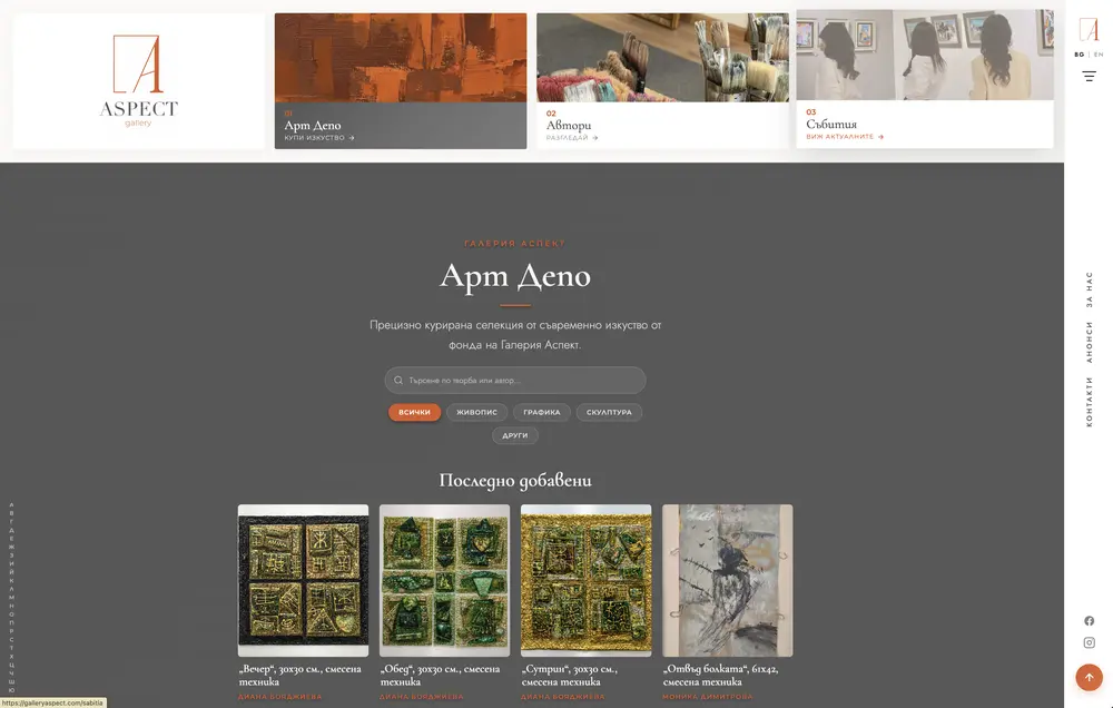
Арт Депо - каталогът с творби с търсене и филтри
WordPressChild themeACFREST APIVanilla JSPHP 8AI translationCustom auth
Visit galleryaspect.com
Лого на Emocia BG02Emocia BGA personalised-gifts shop rebuilt end to end - from the storefront to the screen the team works on.E-commerceRedesign + AI assistant + operations2026

The brief

Emocia BG sells gifts made by hand from the files a customer uploads - photo collages, engraved clocks, plates that play a recorded voice message. The shop had been running for years and had collected what every living shop collects: an inherited theme, patch upon patch, pages nobody remembered writing.

The work did not start with design. It started with a full inventory of the code - and that inventory set the order: foundations first, then the storefront, and last the screens where the team spends its day.

Nearly every customer arrives from Instagram or TikTok, through the browser inside the app. So every decision was tested there first.

What I built

  1. A full redesign, section by section Around 25 purpose-built modules replaced the inherited theme: a homepage with a product slider, gift-finder segments, a four-step "from photo to gift" explainer, reviews, bestsellers, and every inner page rebuilt. A new shop category appears on its own - there is no page to maintain.
  2. The AI gift assistant A guided chat that recommends real products from the catalogue, backed by about 70 answers the owner edits herself. What it does not know goes to the team, conversation attached - instead of being guessed at.
  3. Personalisation without a developer Free-text fields the owner configures per product - until then every field was hard-coded, and a new product type meant calling a programmer. Plus multi-photo uploads with exact counts, voice-message recording, and answers shown in the checkout summary before paying.
  4. Ordering that survives TikTok The flow was rebuilt for in-app browsers, where orders used to stall halfway. "Order without a photo" saves the sale when a file will not upload - the customer sends it later, and the team sees the order in its own filter.
  5. The team's screens The orders list and the single-order screen reworked for production rather than warehousing: phone and status one click away, quick filters with live counts for express and waiting orders, everything about an order on one screen.
  6. Consent and privacy A cookie banner without a plugin, built on a real audit - every cookie accounted for, and tracking that actually stops when someone declines. A privacy policy rewritten for a shop that stores photographs of real people.

The result

  • PageSpeed Insights: from 48 to 94 on desktop
  • Around 60 custom modules - documented, ordered, nothing left to chance
  • Far fewer abandoned orders from Instagram and TikTok - and organic growth on TikTok
  • A new product or category without a line of code
  • The team's day fits on one screen
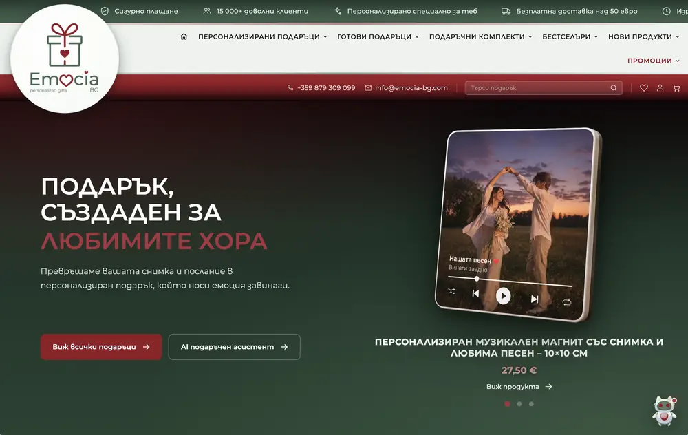
Началната страница на emocia-bg.com
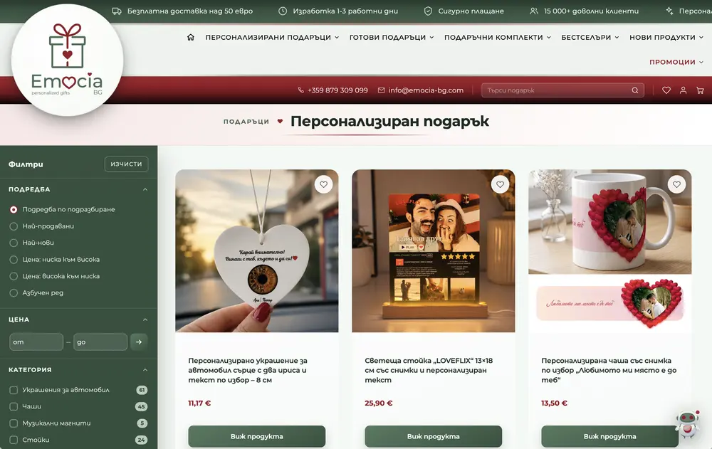
Каталогът на Emocia BG с разширено филтриране
WordPressWooCommerceChild themeHPOSPHP 8Vanilla JSREST APIAI асистентEcont / Speedy / BOX NOWStripe
Visit emocia-bg.com
Лого на Impressive03The Impressive AgencyA brand new to the web: logo, design and site built from a blank page - for an agency in the business of first impressions.AgencyLogo + design + site2026

The brief

Impressive stages corporate events and scientific conferences - and alongside them offers web solutions, video production and AI integrations. An agency that lives on strong first impressions.

There was no website. None. No logo either. There was a name - and that name sets its own bar: you cannot be called Impressive and show up online with a template.

So everything started from a blank page: the mark first, then the visual language, and finally the site that brings them together.

What I built

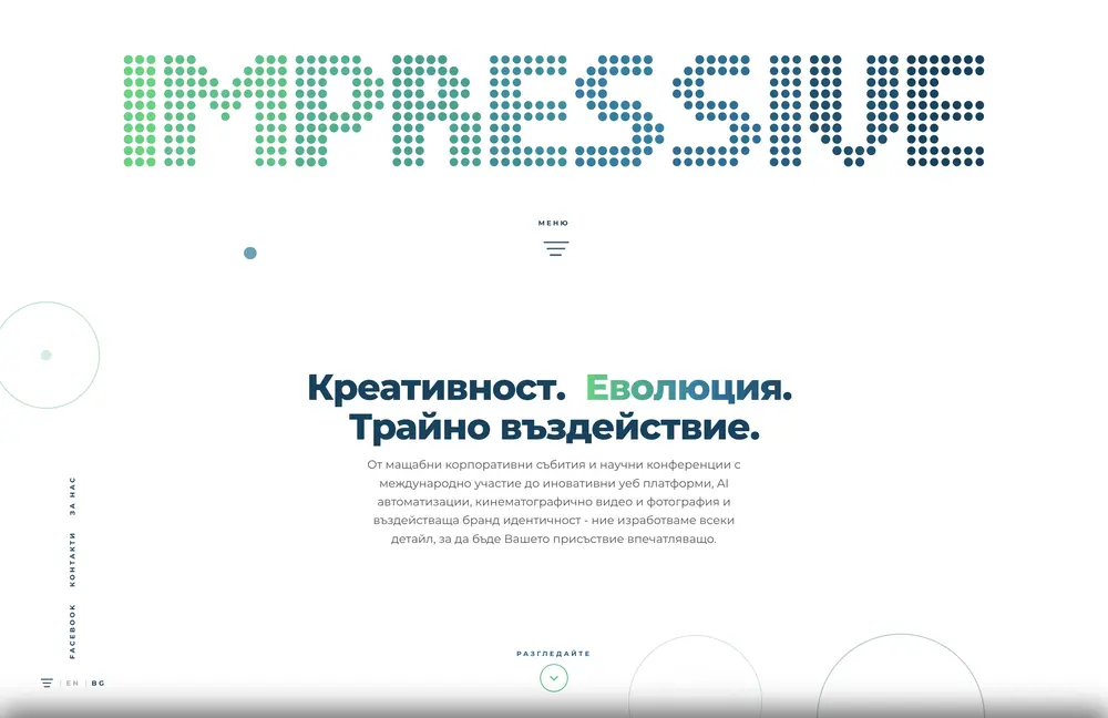
  1. The logo A circle of dots fading from green into blue - like hall lights a moment before the show begins. The same dots spell out the name IMPRESSIVE, letter by letter. One mark that works equally well on a business card, on a stage screen and in a browser tab.
  2. A design system from zero The dots became a language: they guide the eye through the headings, mark the sections, drift quietly in the background. No template as a starting point - typography, colour and motion all derived from the mark itself.
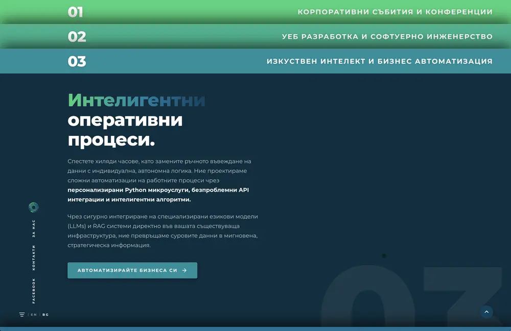
  3. The site Services unfold as numbered bars - 01, 02, 03 - each opening into its own story. The AI practice got a dark chapter of its own, so it stands apart. Everything in Bulgarian and English.
  4. A partnership beyond the site The work did not stop at launch: under the Impressive banner I have since built four platforms for their clients. The first project grew into a long collaboration.

The result

  • A brand recognisable from the first screen - mark, colour and motion as one
  • From nothing online to a presence that lives up to the name
  • Four client platforms built after the site, under their brand
  • A bilingual site - Bulgarian and English
Началната страница на impressive.bg с логото от точки
Секцията с услуги на impressive.bg с номерирани ленти
Logo & brandingDesign systemUI/UXAnimationGoogle Apps ScriptLead captureBG / EN
Visit impressive.bg
Лого на Сдружение Онкологичен компас04Oncology Compass AssociationAn annual conference, a journal, a cause - and not one page online. The site grew out of the logo.HealthcareDesign + site2026

The brief

Oncology Compass is a Bulgarian association where medical specialists and cancer patients pull in the same direction: treatment decided by teams rather than by one doctor alone, following current European standards, with patients kept informed rather than kept out.

They run a conference every year. They publish a journal. There were partners, sponsors and news worth sharing - and nowhere to send anyone. Invitations went out without a single link on them.

What did exist was a logo, and a good one: a compass rose whose needles are a scalpel, a microscope, an atom and a strand of DNA, with a human figure standing at the centre. Everything else was built from there.

What I built

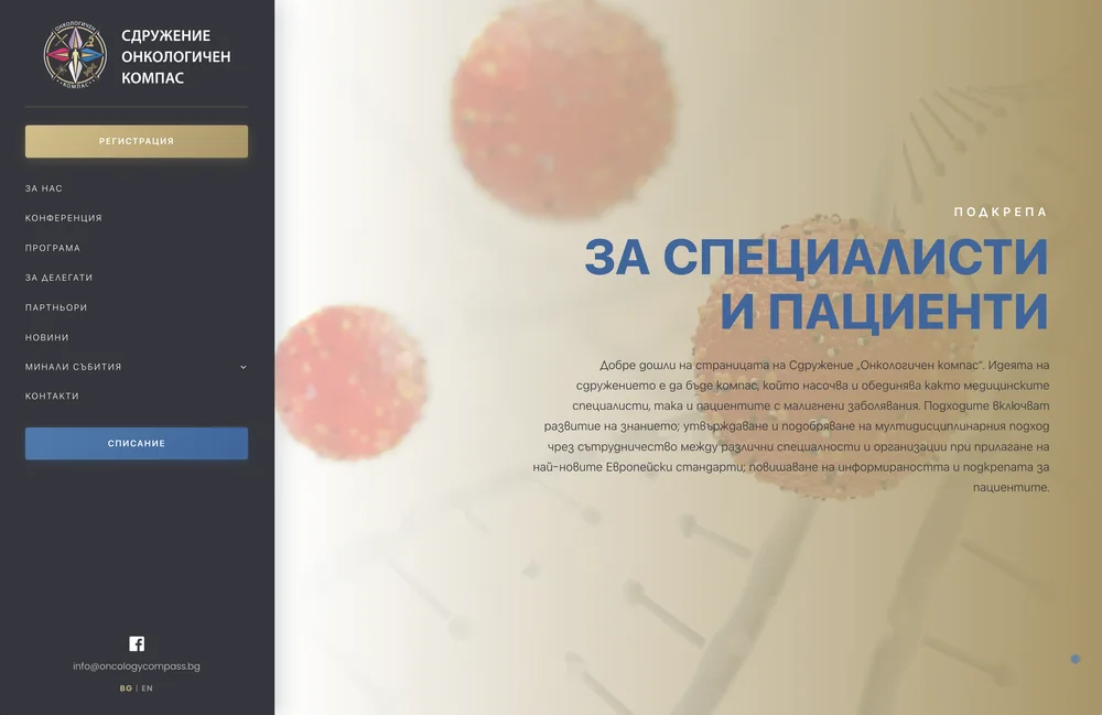
  1. The palette came off the mark Charcoal, gold and the coloured feathers of the rose moved from the logo onto the pages. Every colour on the site can be traced back to the sign - none was brought in from outside.
  2. A sidebar instead of a header Navigation runs down the left in a dark column, with conference registration pinned at the top in gold. Whatever page you are on, the button is in sight.
  3. Built around the conference Programme, delegate information, news, contacts. Past editions are not deleted - they settle into an archive of their own.
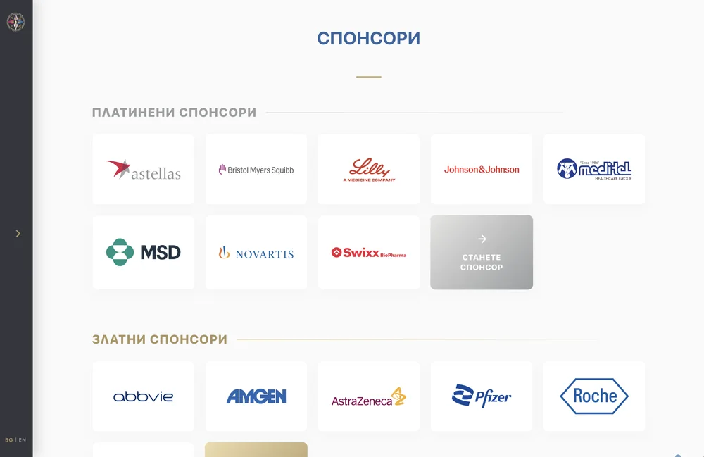
  4. Sponsors shown by rank Platinum above gold, one card per logo, and the row closes with an open invitation: "Become a sponsor".
  5. Bulgarian and English The conference draws guests from abroad, so every page speaks both.

The result

  • An address the association can finally print on a conference invitation
  • The site looks like the logo - the brand reads as one piece
  • Registration stays on screen from whichever page you start
  • A sponsors page that does part of the recruiting on its own
Началната страница на oncologycompass.bg с вертикална навигация
Страницата със спонсори на oncologycompass.bg с платинени и златни нива
WordPressGutenbergPHPCustom designUI/UXBG / EN
Visit oncologycompass.bg
Лого на ЛайВс Клиник05LyVes ClinicA clinic site rebuilt end to end - custom artwork, a blog, and appointments that land straight in the clinic's calendar.ClinicRedesign + booking2026

The brief

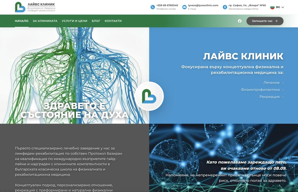
LyVes Clinic in Sofia runs Bulgaria's first specialised practice for lymphedema rehabilitation, working to a protocol of its own built on international guidelines. "Health is a state of mind," their motto goes.

Their website had been started at some point and had stayed halfway there. Meanwhile the clinic needed the essentials: a proper presentation, a blog worth reading, and a way for patients to book a visit without picking up the phone.

The job covered all of it at once - a full redesign, illustrations made to the team's own brief, and a booking system wired to the clinic's real calendar.

What I built

  1. The redesign The green and the blue of the heart mark now split the homepage itself in two, echoing the halves of the lymphatic system in the hero illustration - and an animated logo greets every visitor.
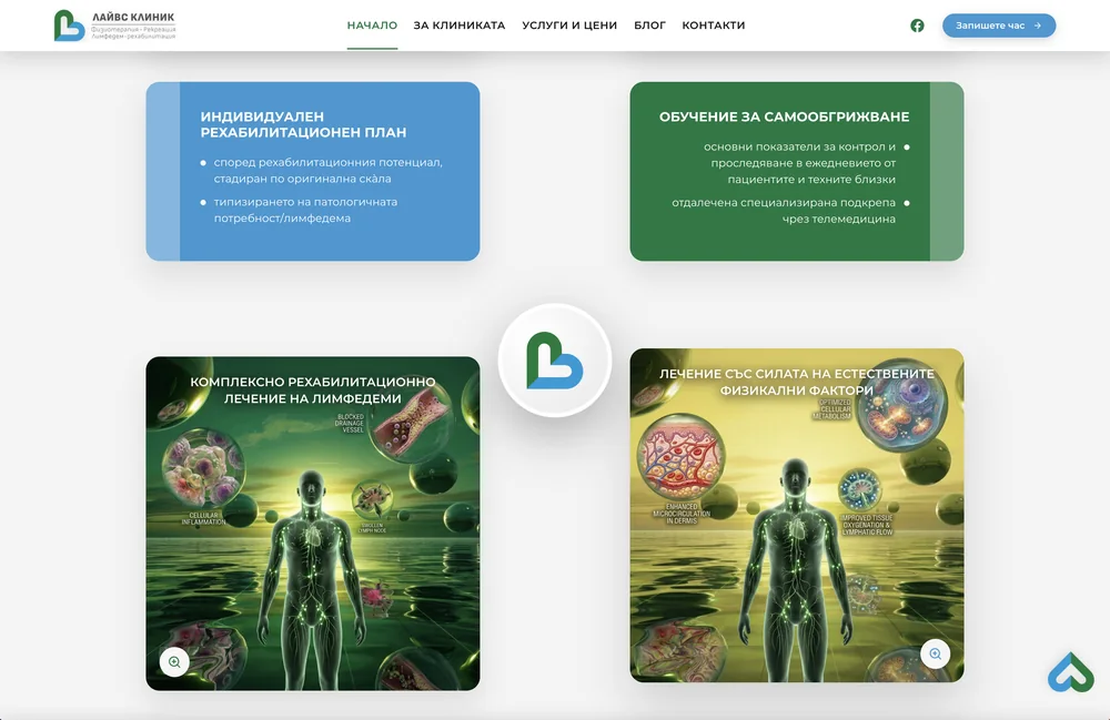
  2. Artwork instead of stock photos The homepage images were created for this clinic from the team's requirements: the lymphatic system in the brand's two colours, the effects of treatment drawn cell by cell.
  3. Booking against the real calendar The date picker shows only genuinely free slots, and a confirmed appointment is written straight into the clinic's Google Calendar - powered by Google Apps Script, with no booking-platform subscription attached.
  4. A blog with a doctor's voice A home for the clinic's articles - because not every swelling is lymphedema, and patients go looking for answers.

The result

  • The site finally matches the clinic: calm, clear, in the colours of the mark
  • Patients book around the clock, with double bookings ruled out
  • No monthly fee for a booking platform - the system belongs to the clinic
  • The blog gives the clinic a voice patients can find
Началната страница на lyvesclinic.com - Здравето е състояние на духа
Авторските илюстрации на началната страница на lyvesclinic.com
RedesignBookingGoogle Apps ScriptGoogle CalendarAnimationBlog
Visit lyvesclinic.com
Лого на Българското дентално лазерно общество06Bulgarian Dental Laser SocietyTwelve laser academies of history - and only the latest one visible online. A new logo, a new site, the full story in place.HealthcareLogo + redesign2026

The brief

Since 2012 the Bulgarian Dental Laser Society has been the meeting point for dentists who work with lasers. Twelve editions of the Dental Laser Academy, certified courses run with New Bulgarian University and the Bulgarian Dental Association, membership of the international ISLD - a real track record.

Online, though, you could only see the tail end of it: the existing site presented the 2025 academy and little beyond. An organisation with that much history deserves a page about itself, not a poster for one event.

So I started over: new logo, new design, new structure - and not a single conference lost along the way.

What I built

  1. The logo The outline of a tooth and a laser point splitting into five coloured beams. A simple mark that says the organisation's full name without a single word.
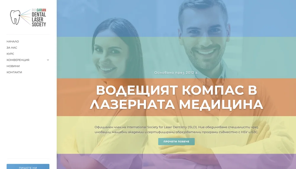
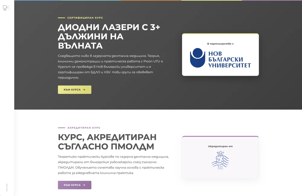
  2. A design led by the beam The five beam colours became the system of the site: a colour band runs through the hero, every section carries its own hue, and each course has its card - yellow for NBU, purple for the Dental Association.
  3. A site about the society, not the event Home, history and mission, courses, news, contacts. The conference is one of the pages - not the whole site.
  4. The academy archive Past editions kept and ordered in their own section. Twelve academies now read as a series, not as one isolated event.
  5. The paperwork, in order Privacy policy, cookie policy, terms - and a consent banner that actually asks before it remembers.

The result

  • The society presents itself as a society with a history since 2012, not as a single event
  • Logo and site speak one language - the five colours of the beam
  • The academies live in one place, past editions included
  • The NBU and BZS courses have pages of their own to point people to
Началната страница на bdls.org с петте цветни ленти
Страницата с курсове на bdls.org - сертифициран курс с НБУ и акредитиран курс от БЗС
Logo & brandingWeb designUI/UXRedesign
Visit bdls.org

The stack

Five layers. Hover over one.

L5InterfaceWhat people see and touch

Semantic HTML, clean CSS and soft, considered motion. The interface reads equally well for people, screen readers and Google - and moves smoothly on anything from an old phone to a large monitor.

Semantic HTML5CSS GridContainer queriesoklchVanilla ES6+ReactWCAG 2.1 AACore Web Vitals
L4ApplicationThe site and the software in it

WordPress or Next.js - whichever fits the job, not the habit. The code is organised, versioned and commented, so every next step stands on solid ground.

Next.js App RouterWordPress FSEChild themesBlock patternsWooCommerce BlocksPHP 8TypeScriptSSR / SSG
L3DataStructured and in order

Content lives in structured fields, not free text. That is why it can be searched, filtered, translated and shown wherever needed - without anything breaking along the way.

Custom post typesACFWP REST APIGraphQLTransients + RedisJSON-LDPrepared statements
L2AutomationThe work that stops being manual

Enquiries that file themselves into a spreadsheet. Quotes that send themselves as PDFs. One-button translations. The repetitive work goes to the machine; your team keeps the real work.

Google Apps Scriptn8nMake.comWebhooks + HMACPythonFastAPILLM интеграцииPDF генериране
L1FoundationWhere it all lives and how it stays up

Git, a staging environment, automatic backups, hardened security. The boring part nobody sees - right up until it matters. Then it decides everything.

GitLocal-first workflowStaging → productionАвтоматични бекъпиSecurity hardeningCDN + edge кешGDPR по подразбиране

How it goes

Five steps. The first one is free.

01

Consultation

A thirty-minute conversation. You tell me what you need; I tell you honestly what it takes and what it costs.

No charge
02

Architecture

Page structure, content model, which features are custom. Agreed in writing before design begins.

03

Design

You get a living prototype in the browser - real colours, real animations, on desktop and phone. You approve it before the real build begins.

04

Build

Code written locally, kept in git, reviewed on a test environment. Your live site is never touched directly.

05

Handover

Launch, training, and every credential in your name. The code is yours - with me or without me.
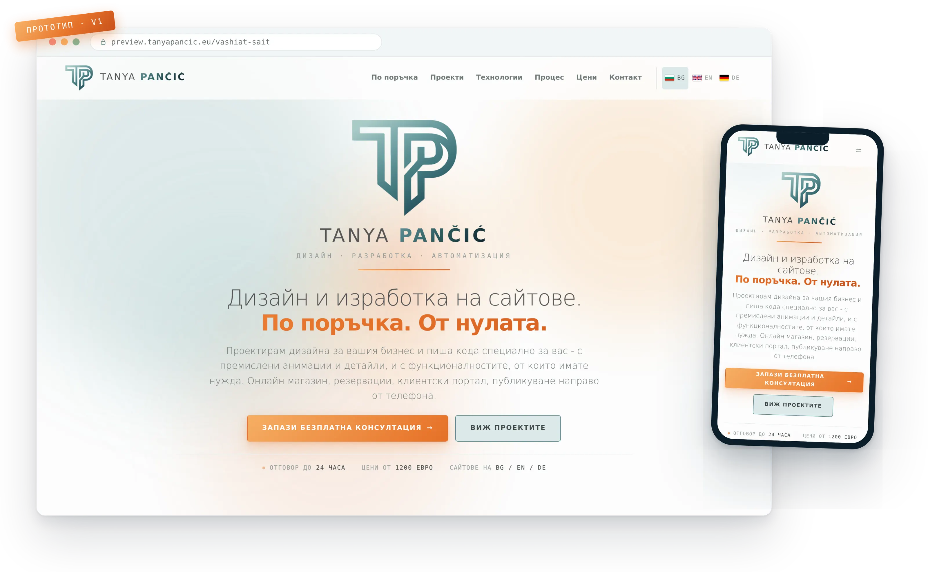
Жив прототип на сайт, отворен в браузър на компютър и на телефон

Pricing

Every tier starts with design from scratch.

Tier 01

Landing page

from490EUR

One page that says what you do and brings in enquiries. The fastest way to get online.

  • Design made just for you, one page
  • Contact form with spam protection
  • Mobile first and quick to load
  • GDPR cookie banner and a legal page
  • Hosting, domain and SSL - set up
  • Live within a week
  • One language
  • No inner pages
  • No shop
Enquire
Tier 02

Custom site, small scope

from890EUR

A site designed for you and coded by hand - kept tight in scope so the price stays accessible.

  • Design made just for you, up to 5 pages
  • A living prototype you approve up front
  • Mobile first, built for Core Web Vitals
  • Contact form with spam protection
  • Basic SEO, sitemap and Google Search Console
  • Legal pages and a GDPR cookie banner
  • Hosting, domain and SSL - set up
  • A short handover session
  • One language
  • No custom functionality
  • No shop
Enquire
Most projectsTier 03

Custom site or online shop

from1400EUR

The full site, plus the integrations and languages a real business runs on.

  • Everything in tier 02, larger scope
  • Online shop or a booking system
  • Payments, shipping and maps - integrated
  • Up to 10 products uploaded for you
  • Up to three languages with correct hreflang
  • Structured data and technical SEO
  • Analytics, pixels and conversion tracking
  • Automatic emails - confirmations and orders
  • Training and a thorough handover
  • One month of support after launch
Enquire
Tier 04

Custom platform

from2500EUR

When the website is the smaller half of the job. Quoted against your brief.

  • Everything in tier 03 as the base
  • Client portals and publishing tools
  • Booking and quoting built around your logic
  • Process automation and API integrations
  • AI features - translation, content, processing
  • Web applications - Next.js or WordPress
  • Technical audit and architecture up front
  • Priority support and development
Enquire

Monthly maintenance

Updates, backups, monitoring and small changes every month. The scope depends on the site - we settle it at the consultation.

quoted individually

Yearly maintenance

The same care, planned for the whole year - at a better rate and with priority when something urgent comes up.

quoted individually
Free consultation to startFixed price after a clear briefPayment in two or three instalmentsScope and timeline in writing

The exact quote depends on scope and features - which is why we start with a conversation, not a calculator.

Таня Панчич

Let's talk about your website.The consultation is free.

A thirty-minute call online. You tell me about your business; I tell you honestly what it takes, how long it lasts and what it will cost. No commitment on your side.


JNP Bulgaria EOOD · VAT BG206865625
Only strictly necessary cookies. Analytics only with your consent. More